
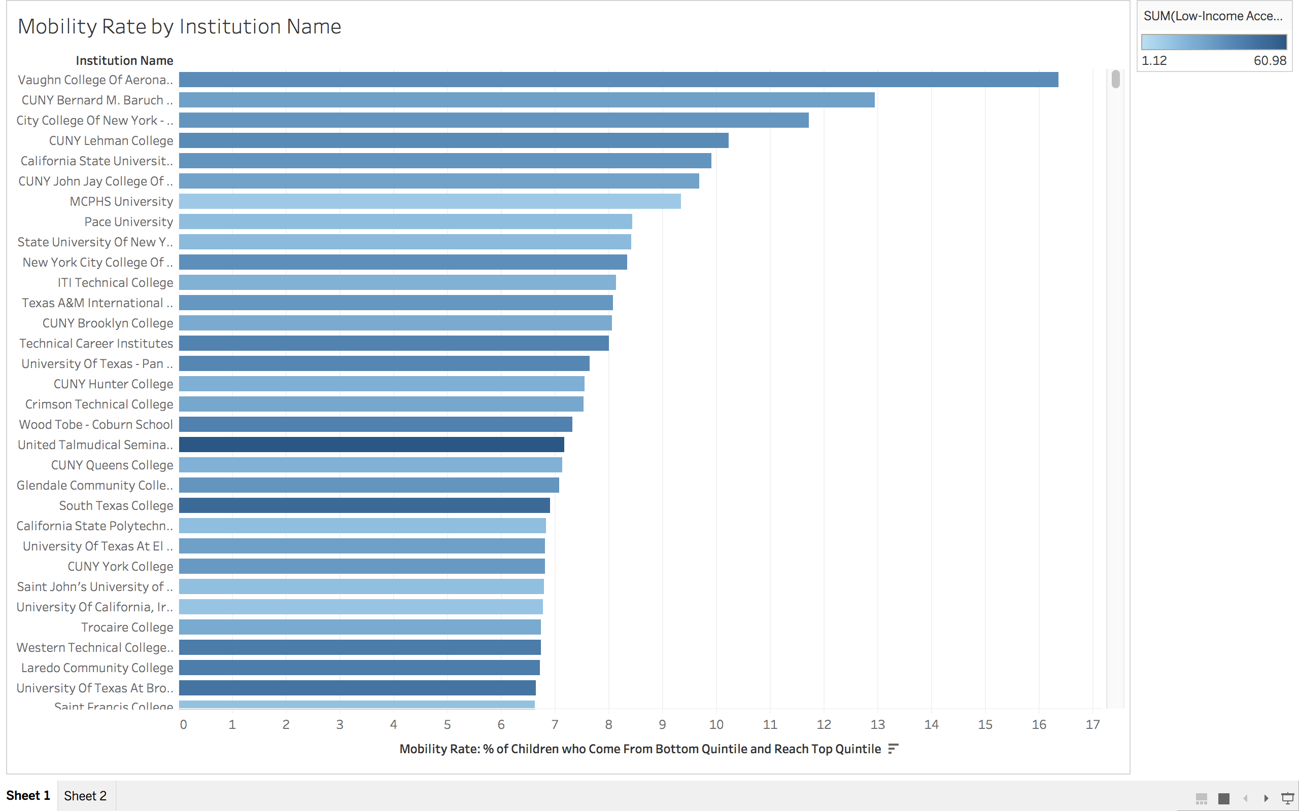
So, maybe I cheated on this one. I’ll let you decide. Above is my sketch of what I envision our data visualization to look like. This is a rough visualization of even that, so maybe that is why I don’t feel so bad about this. I honestly am not sure what else it would look like, but maybe that speaks to my lack of imagination. We currently have a strong understanding of which schools are doing a really good job of helping students move up the income ladder. What we don’t know is why some schools do so well or what the key elements are that enable schools to improve in terms of their mobility statistics. Hopefully we will be able to use the data (and some cool tools) to see what those elements are.
Data Viz Sketch